In this Blog, we will brief about the power of colors in interior design in 2025. The Color plays a fundamental role in interior design, influencing emotions, perceptions, and the overall ambiance of a space. The right color choices can make a room feel cozy, expansive, energetic, or serene. This blog post will discuss the transition of colors, how to do it effectively in different rooms, and how to create the desired harmony in interiors.
1. Understanding Colour Psychology
Colors have psychological effects on human behavior and mood. Each color evokes different feelings and emotions, which is why selecting the right color scheme is essential for interior design.
Warm Colors
Because they produce a friendly and vibrant ambience, warm hues are perfect for animated and convivial venues.
- Red: Evokes passion, warmth, and excitement. Best used in dining rooms or accent walls.
- Orange: Promotes enthusiasm and creativity. Is effective in living spaces or home offices.
- Yellow: Brings happiness and positivity. Suitable for kitchens and sunrooms.
Cool Colors
Cool colors are calming and soothing, making them perfect for relaxation areas.
- Blue: Symbolizes tranquillity and stability. Ideal for bedrooms and bathrooms.
- Green: Represents nature, balance, and renewal. Great for living rooms and offices.
- Purple: A mix of energy and calmness, often linked to luxury and creativity. Works well in bedrooms and lounges.
Neutral Colors
Neutral shades provide balance and act as a backdrop for accent colours-+-.
- White: Signifies cleanliness and openness. Common in minimalist and modern designs.
- Gray: Represents sophistication and versatility. It merges beautifully with the color cycle .
- Beige & Taupe: Offer warmth and subtlety. Great for cozy interiors.
2. Choosing the Right colors for Different Spaces
Each room in a home or office serves a specific function, and the colour palette should align with the purpose of the space.
Living Room:
- Opt for warm and welcoming tones like soft beige, warm greys, or muted greens.
- Add pops of color through furniture and décor elements like cushions, rugs, or artwork.
Bedroom:
- Soothing colours such as pastel blues, lavenders, or light greys promote relaxation.
- Darker hues like deep green or navy blue create a cozy and intimate ambiance.
Kitchen:
- Bright and energizing shades like white, yellow, or light green enhance openness.
- Accent colors like red or deep orange can stimulate appetite and create a lively atmosphere.
Bathroom:
- Light blue, soft greens, or crisp whites create a spa-like feel.
- Darker hues like charcoal or deep teal add a modern and luxurious touch.
Home Office:
- Blue and green shades improve focus and concentration.
- Warm neutrals with pops of orange or yellow can stimulate creativity.
3. Color Combinations and Harmony
Understanding how colors interact helps in creating balanced and aesthetically pleasing interiors. Some common color schemes include:
Monochromatic Scheme
Implementing multiple shades and tints of one color to get the desired reach sophisticated outlook.
Analogous Scheme
To get the harmonious effect, the paired blue and green colors that match with each other on the wheel
Complementary Scheme
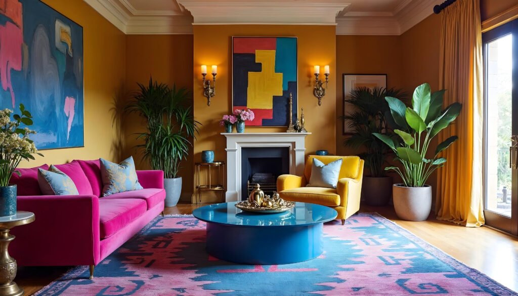
Using opposite colors on the color wheel, such as blue and orange, to create contrast and visual interest.
Triadic Scheme
Using three colors from the wheel that are evenly spaced, such as red, yellow, and blue, to create a lively and energetic effect.
4. The Role of Lighting in Colour Perception
The way colours manifest in a space is greatly influenced by light. Natural light enhances true colours, while artificial lighting can alter shades.
- Lighting with warm tones (yellowish shades) accentuates warm hues such as red and orange.
- Cool lighting (bluish tones) makes cooler colours more pronounced.
- Layered lighting (combining ambient, task, and accent lighting) helps balance colour effects.
Using colours to Enhance Space Perception
- Lighter colours make small rooms feel more spacious and airier.
- Darker colours add depth and intimacy to larger rooms.
- Accent walls serve as focal points while keeping the space from feeling overcrowded.
- Patterns and textures in varying shades add depth and character.
5. Conclusion
The power of colours in interior design cannot be overstated. Whether you’re aiming for a peaceful retreat, a lively social space, or a productive workspace, the right colour choices can transform any interior. By understanding colour psychology, pairing colours effectively, and considering lighting and space perception, you can create harmonious and visually appealing interiors that enhance mood and functionality.
"Stay One Step Ahead with Inspired Interiors"
“We craft timeless spaces that reflect your personality and keep you ahead of the trend.”
Book Today!